A Handout about Marburg
We were supposed to create a handout about Marburg. As regards content, I decided to focus on cultural aspects, i.e. the historic center of Marburg, its cinema, and its theatre. I took this decision out of personal interest. In my point of view, Marburg has a rich cultural life.
|
| ||
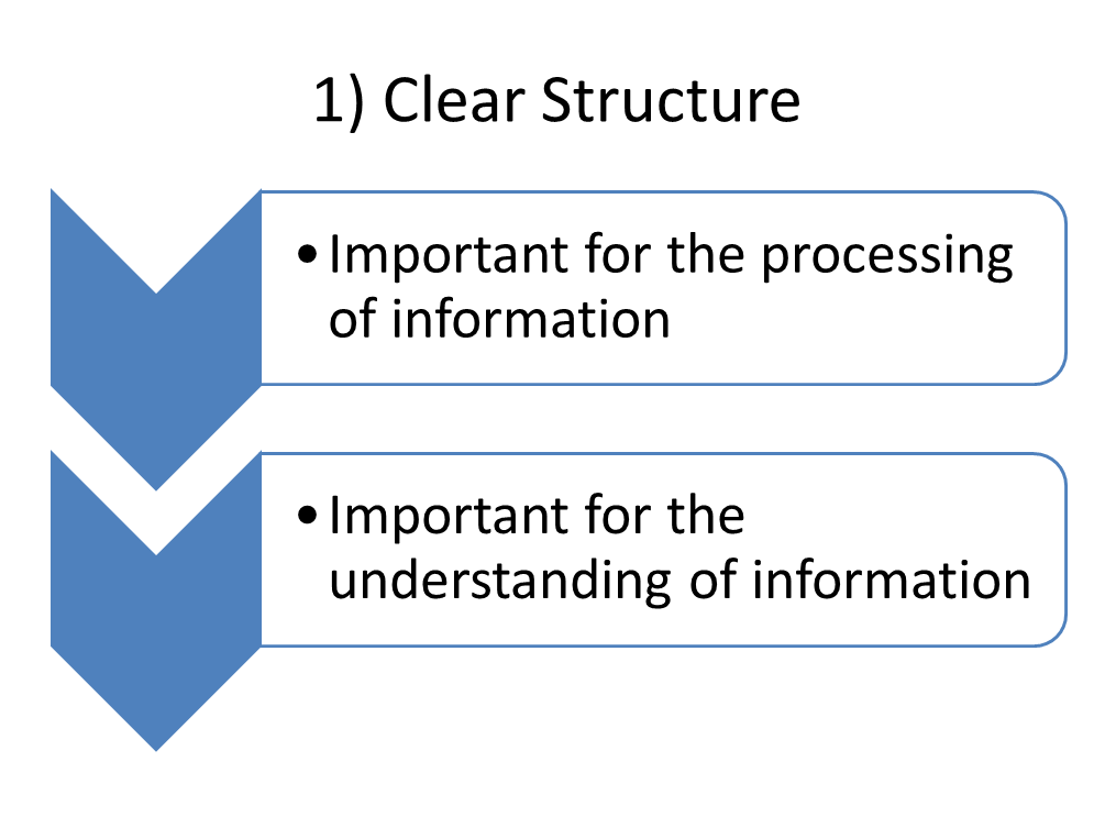
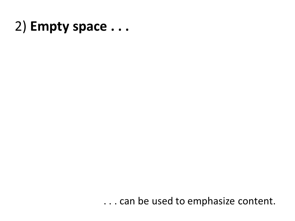
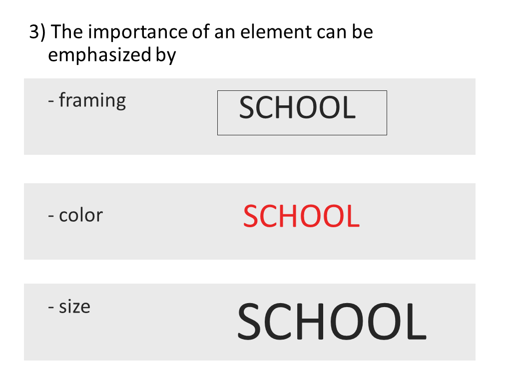
As regards the structure and the design of the handout, I took into consideration important principles of structuring text and the so-called golden rules for good design we got to know in class. The rules are presented through pictures in the gallery below.
After deciding which content I would like to present, I choose a linear way of presenting textual information. A bulleted list is suitable to structure information about the historic center, the cinema, and the theatre. Thus, the recipient can quickly get an overview as this structure is good for processing information fast. I tried to present information concisely since a linear structure requires that sequences are kept short. Otherwise, reading text would be too time consuming. The clear structure of the handout is also achieved by using empty space; this space clearly divides the document in its individual parts.
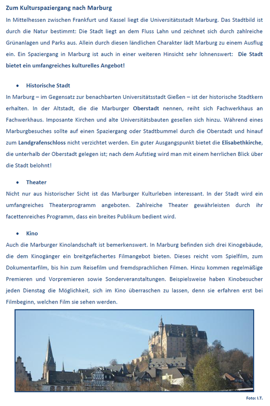
Moreover, I decided to include a personal photograph of Marburg for the purpose of illustration. The photograph adds information to the handout which could not be described by textual elements. However, I avoided overloading the handout with pictures as I really focused on giving an informational input through text. As the dominating colors of the photograph are shades of blue, I decided to use blue as font color. That way, text and picture form a harmonious unity.
As regards the font, I choose a higher font size for the heading and a bold letters for the subheadings. Additionally, I highlighted important and crucial words by using bold letters. This contributes to the document’s clarity and legibility. Moreover, this clarity is also achieved by the typeface which is clear and without embellishment.
Golden Rules of Good Design